Search Usability on Mytheresa
Enhanced search to make it easier for users to find luxury products on Mytheresa’s app.
Role
Platforms
Areas
User Research
Completion
Context
Understanding the challenge
Mytheresa is a global luxury fashion platform with a vast product range. I worked on improving search usability in the mobile app to make product discovery faster, easier, and better aligned with user behavior.
Usability Heuristics
Heuristic evaluation as a starting point
As a starting point, I evaluated the existing search experience using Jakob Nielsen’s 10 Usability Heuristics. This helped uncover usability issues that could disrupt the user journey. Addressing them early allowed me to clean up the interface and build a solid foundation for the redesign.
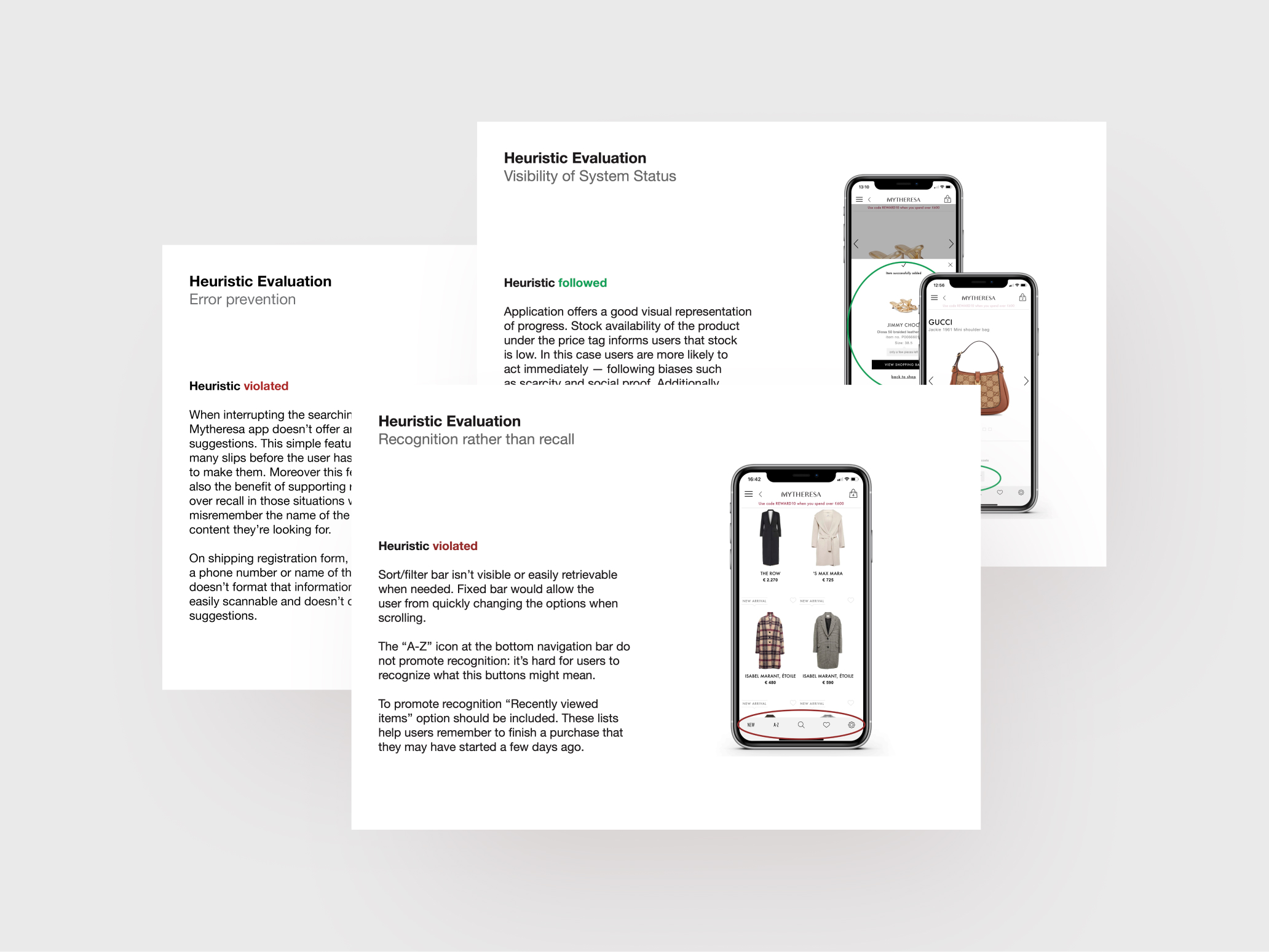
Selected slides from the heuristics evaluation.
User research
I conducted surveys and interviews with luxury fashion shoppers to understand how they search for products and what challenges they face. The insights helped shape the foundation of the redesign.
Search journey
Mapped how users currently search for garments—from opening the app to refining results and making a decision.
Feature needs
Validated which search and filtering features users expect and rely on during product discovery.
Pain points
Uncovered common frustrations and barriers that slow down or interrupt the shopping experience.
Selected outtake from the user survey: Most participants rely on the “Recommended” and “New items” sort options—highlighting a strong preference for relevance and freshness over price-based sorting.
Key finding
“With so many products available, clear sorting and filtering are essential to help me find what I’m looking for.”
— Quote from a user interview participant
Navigation & Filters
Making navigation and filters effortless
Key interface elements like the bottom navigation and filter bar were redesigned for clarity and ease of use. Icons and labels were refined, tap areas enlarged, and filter behavior improved to stay accessible while scrolling—making core actions more intuitive and mobile-friendly.
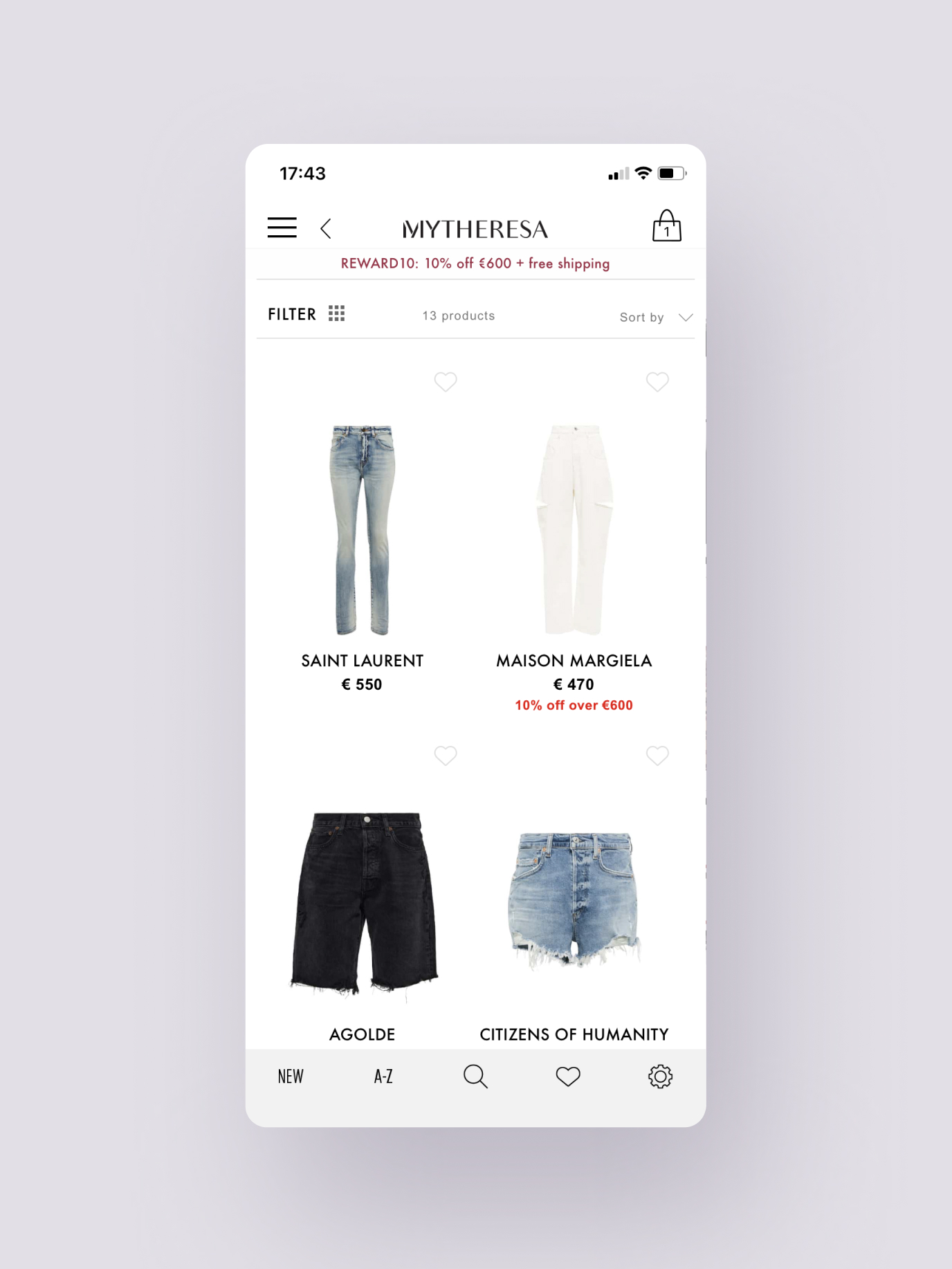
Before redesign
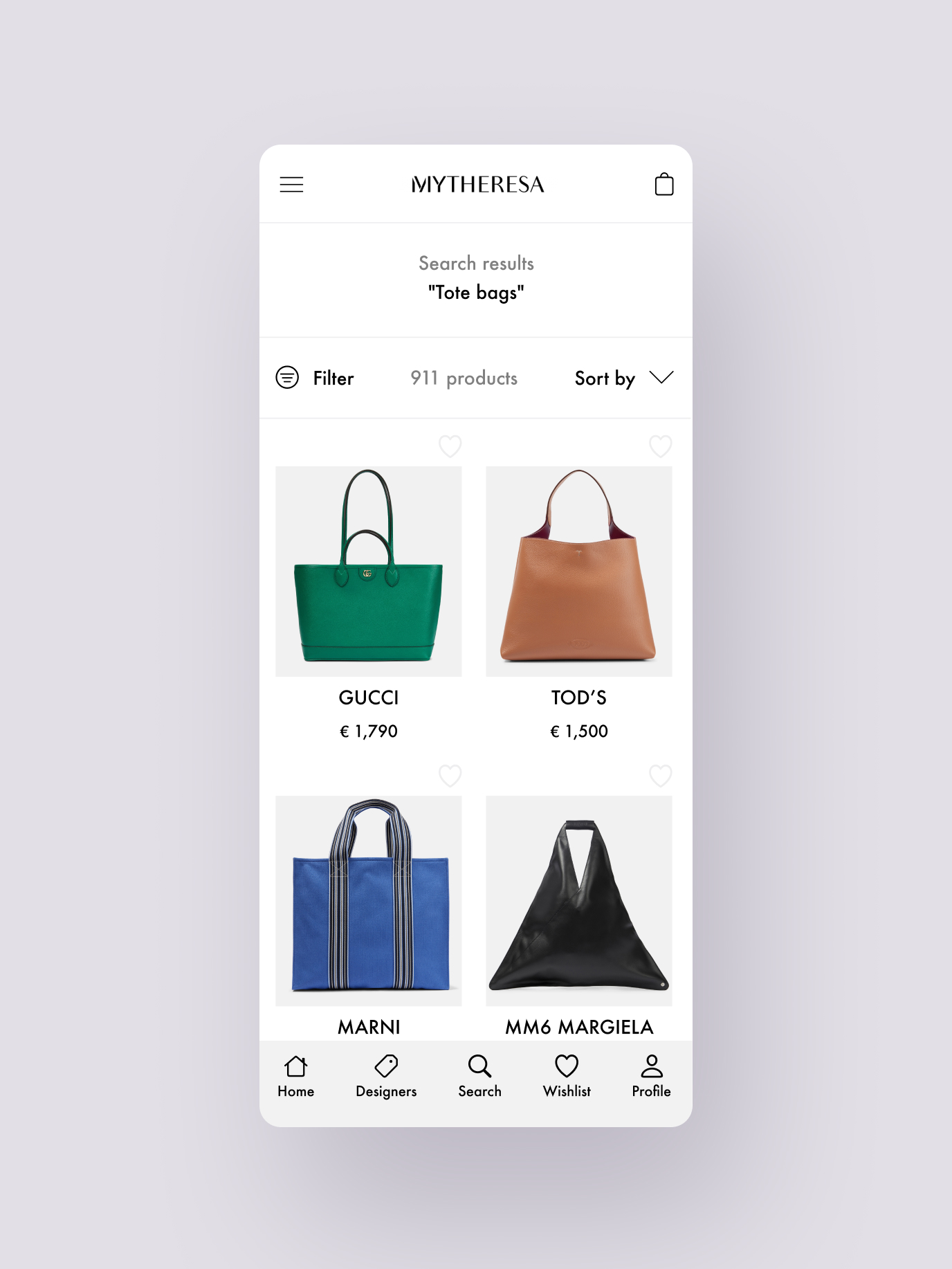
After redesign
Search menu
Streamlining category navigation
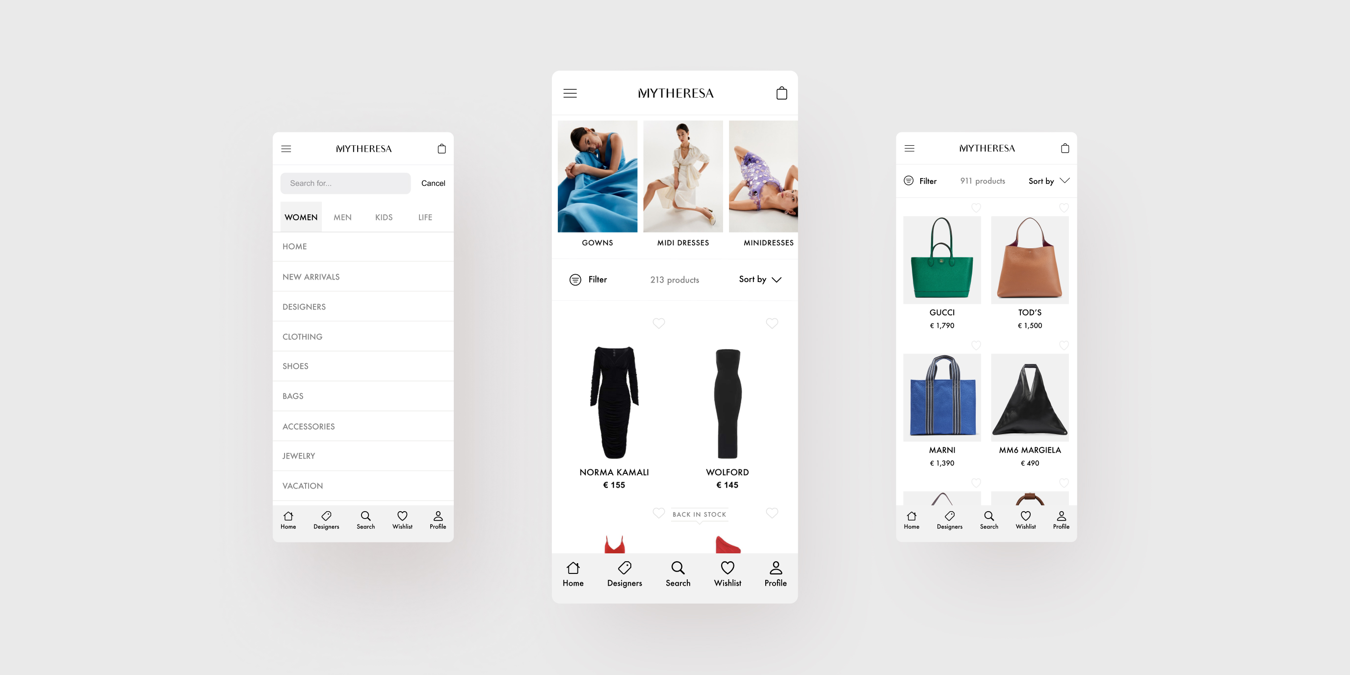
The primary search menu was restructured into a flat hierarchy with clear section headers. This simplified layout helps users scan product categories quickly and decide where to browse.
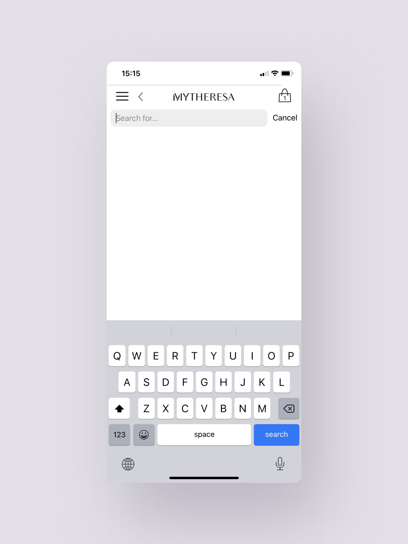
Before redesign
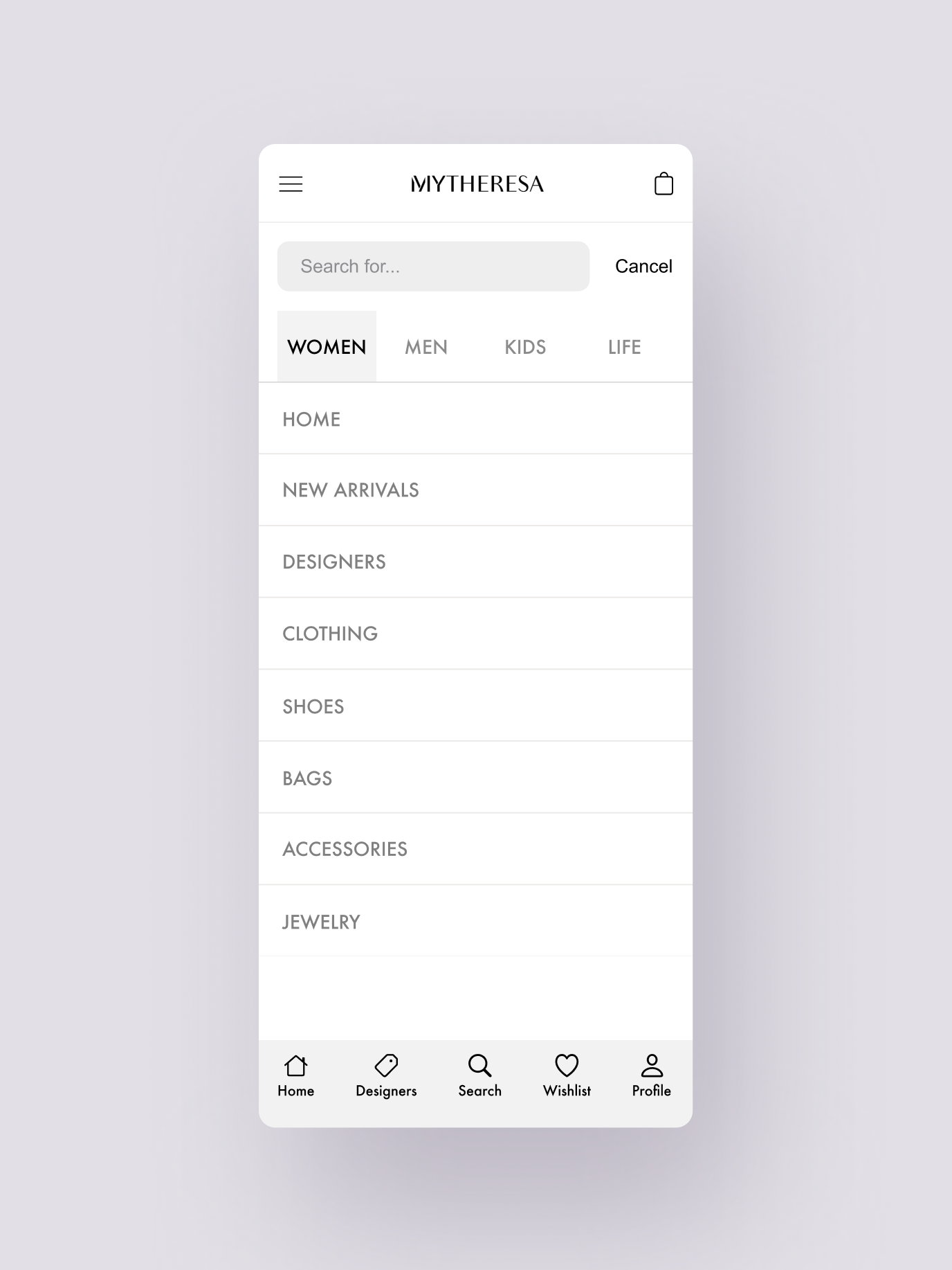
After redesign
Results page
Smarter product results
A visual subcategory system was introduced to organize large inventories within the results page. This improvement supports easier navigation, faster discovery, and stronger visibility for key product segments.
Learnings
If people can’t find your products, they can’t buy them
With over 40% of online purchases happening on mobile, seamless search and navigation are essential—especially in luxury e-commerce. This project reinforced the importance of designing simple, intuitive tools that help users find what they’re looking for, fast.
