Navigation Redesign for Eurowings
Eurowings is the low-cost airline of the Lufthansa Group, part of the world’s largest aviation network. I refined the site’s information and navigation structure to help users easily find the travel details they need, making the experience clearer and more efficient.
Role
Platforms
Areas
User Research
Completion
Project brief
The goal of this project was to create a clearer and more modern navigation structure that aligns with the existing Eurowings brand.
Problem discovery
Finding patterns in user feedback
To uncover relevant problems, I explored reviews on Trustpilot and Tripadvisor, looking for recurring patterns in customer complaints.
Common themes included difficulty finding core features like check-in, booking, and flight status. Many users found the check-in process confusing and noted a general lack of clear information or guidance throughout the site.
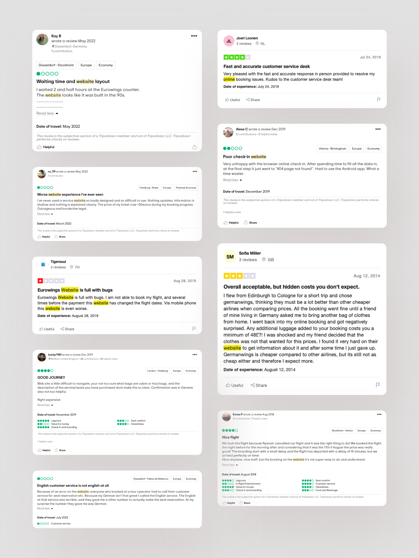
Outtakes from user reviews referencing website usability.
Data and insights
To support the problem findings, I looked into airline-specific data. The insights showed that unclear navigation affects booking rates, user satisfaction, and trust in the digital experience.
of airline website traffic comes from mobile devices, but desktop still drives the majority of bookings.
(Source: industry average / internal airline benchmarks)
airline customers report struggling to locate check-in options or flight status updates on airline websites.
(Source: Trustpilot / Review Analysis)
of travelers visit an airline’s website 2–3 times before completing a booking, often to recheck information like baggage rules, fees, or check-in details.
(Source: Expedia Group Traveler Trends)
Navigation bar
Making key actions accessible
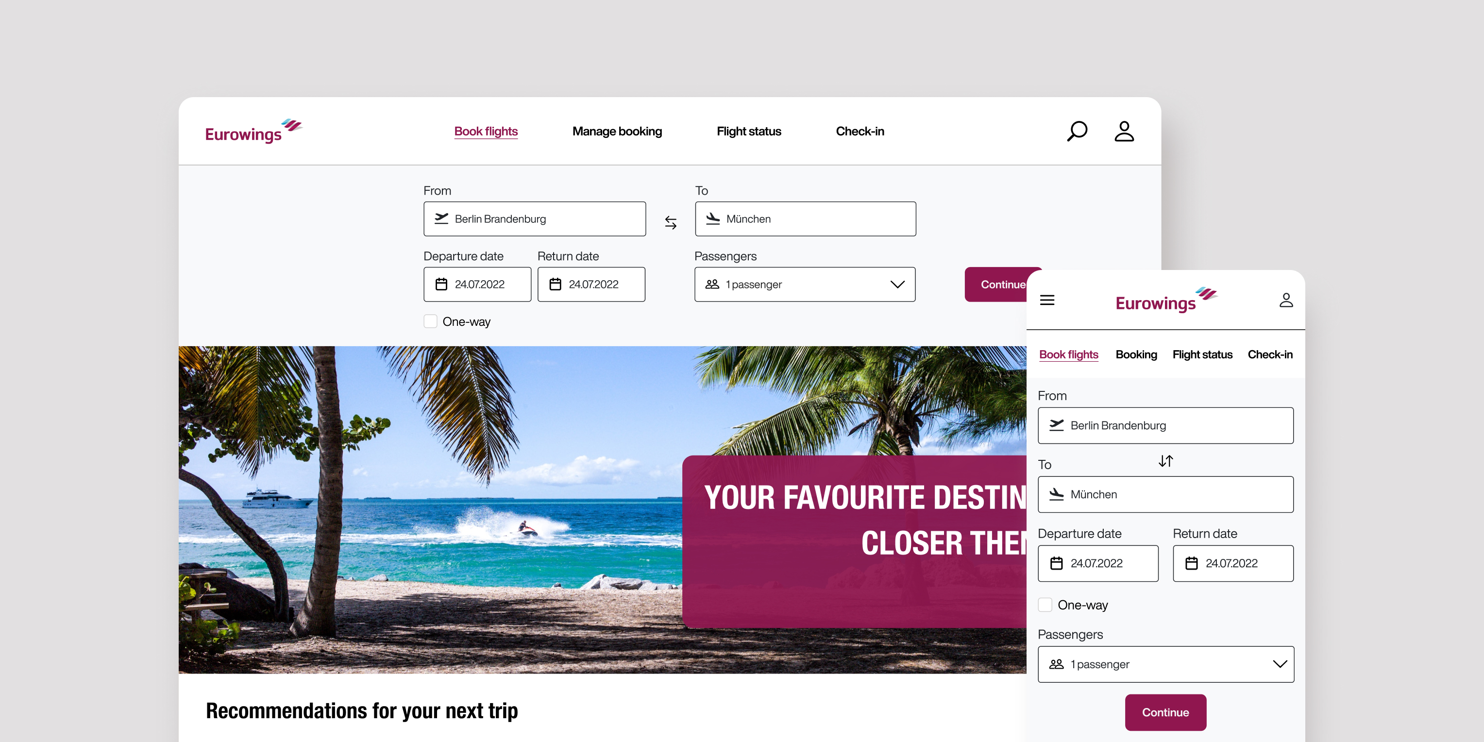
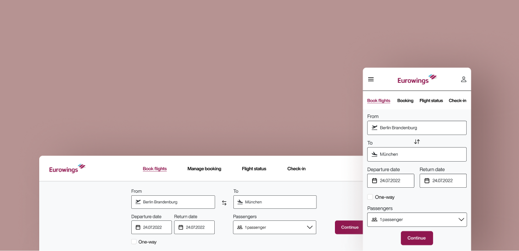
One of the main usability issues on the Eurowings website was the lack of clear, task-focused navigation. Based on user research, I identified four key actions users expect to complete easily: booking a flight, checking in, managing a booking, and viewing flight status. I redesigned the navigation bar to prioritize these functions and make them directly accessible from the homepage.

This is some text inside of a div block.
Search form
Clearer input fields for smoother booking
I redesigned the input fields in the booking flow to improve clarity and usability. Updated labels now remain visible after the field is filled, helping users understand each step and reducing errors when searching for flights.
This is some text inside of a div block.
Access point
Key actions available up front
The four most important travel actions include booking a flight, managing a booking, checking flight status, and checking in. These are now accessible directly from the homepage, allowing users to get started immediately without navigating through multiple pages.

This is some text inside of a div block.
Evaluating impact
To evaluate the success of this navigation redesign, I would focus on key usability and performance metrics that reflect how effectively users interact with the new structure:
Task completion time
Measures how efficiently users can complete critical tasks like booking a flight or checking in, reflecting overall clarity and ease of use.
Conversion rate
Tracks the percentage of users who complete key actions, helping assess how well the design supports user goals and business outcomes.
Error rate
Indicates how often users struggle with forms or flows, revealing usability issues that may cause frustration or task failure.